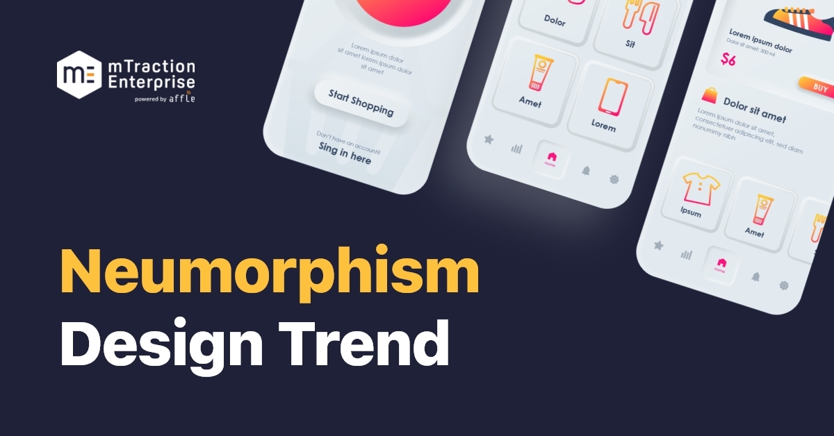
Neumorphism – Let’s Implement the New Trend in UI Design
The UI domain is abuzz with a new trend – neumorphism. The minimalism-driven concept borrows from its ancestor, skeuomorphism. However, instead of a focus on the similarity between digital icons and real-world objects, as is the case with skeuomorphism, the spotlight is on a subtle color palette and shadowing technique.
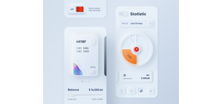
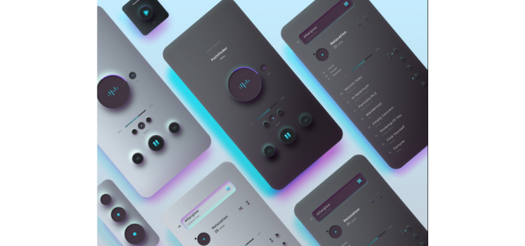
The appearance of the user interface in neomorphic is such that various elements appear to be under or within the background. Something about this gives the UI an Avante Garde feel. It reflects what users might expect to see in sci-fi, television series.
This is the Dribbble snap that kickstarted the trend of neumorphism and shot it to popularity.
How did the design trend shift to neumorphism?
Skeuomorphism came about to make the smartphone user interface as intuitive as possible. This type of design made various elements – such as a call “button” on a smartphone screen – look glossy and also rendered a “raised” 3D effect. It made absolute sense when the world was migrating from physical buttons to touchscreens.
The idea was for people to know where to click and to know when a button has been “pressed”. But as people became more and more habituated to the smartphone screen and the absence of a physical button, the need for the bridge (represented by skeuomorphic design) dissolved.
Flat design came along and pulled the red carpet from beneath skeuomorphism’s feet at this point. The flat design did away with space heavy elements and replaced them with very 2D-looking versions of themselves. Gradients, glossiness, and texture made way for a more functional UI that was also easier to scale for different screen sizes.
But for all its benefits, flat design is less intuitive and perhaps a tad too minimalist. Even the designers got bored with it very quickly. Neumorphism came along to offer a user interface that is both intuitive and also easily scalable.
Neumorphism takes into consideration real-life science like gravity and physics and it does use the shadows that were so typical to skeuomorphism. It just does so with more subtlety. Rather than recreating what exists in real life, one might say it creates an innovative digital avatar of real-life objects.
Basically, neumorphism is a marriage between flat design and skeuomorphism. It borrows minimalism from flat design and effective shadowing from skeuomorphism effectively attempting to bring the best of both worlds to UI design.
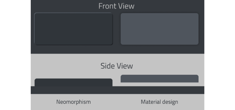
Some very typical differences include the envisioned side angle of elements in neumorphism versus skeuomorphic design is that in skeuomorphic design the element will appear to hover above the background whereas, in neumorphic design, the element looks like it is growing out of the background.
Elements are also built out of the same material as the background in neumorphism – the two are differentiated simply by effective shadowing. The absence of too many colors is one of the biggest differentiating factors of neumorphism; the overall look is very soothing to the eye.
What are the main design elements in neumorphism?
Now, we’ll talk in detail about the core design elements:
1. Color palette
The color palette in neumorphism has to steer away from plain black or white backgrounds because of the need for lighter shades and darker shades to create the typical minimalist 3D effect that is unique to the design concept. True – neumorphism uses very subtle colors, mostly pastels or beiges cream and grey, but it uses colors nonetheless.
The design will usually use several shades within the same color family – typically four or five shades. You will have the main background, a light shadow, a dark shadow, the shape’s background, and a border, which some designs make use of and others do not.
2. Representation
It cannot be underscored sufficiently, how neumorphism attempts to create an interpretation of real-world objects, rather than mimicking them very strictly or mirroring them.
3. Shapes
Again, in keeping with the theme of minimalism, the shapes are clean-cut and commonplace – rectangles and circles are the building blocks here.
4. Effects
The best part about neumorphism is that while it is more exciting to create than flat design, it is still easy to work with. It doesn’t take the app developer’s equivalent of a rocket scientist to develop a beautiful and functional user interface using the tenets of neumorphism.
The effects most commonly used include Double Drop Shadows, Fill, Gradients, and Stroke. As mentioned under Colour Palette, some designers might also make use of Inner Borders.
Designers, app developers, and end-users are excited about the fresh and futuristic appearance of user interfaces that use neumorphism. The voice of dissent, however, names the following factors as neumorphism’s stumbling blocks.
Low contrasts create accessibility issues. The buttons might not look like buttons to some users, especially those with less-than-perfect eyesight. Consider people with glaucoma who cannot comprehend the depth, for instance. However, there is the fact that smartphone brands are now offering differing UI options to cater to their elderly users more effectively.A case in point is Samsung Zone V where text size and colours can be chosen based on what is most convenient (or visible) to the user. Similarly, in different types of light, users might not be able to view the subtleties that are so integral to making the buttons visible. Users with low-quality screens might also face such button-based issues.
Low contrasts also become a problem when the goal is to be eye-catching. What happens then with ‘click here to buy now’ and ‘sign up now’ and other bright green or electric blue CTA buttons? CTA buttons are intended to create a sort of disturbance on the screen. They matched with glossy and gradient-heavy UI elements that were the trademark of skeuomorphism. It remains to be seen whether neumorphism will evolve to accommodate shiny CTA buttons or whether CTA buttons will tone it down to match neumorphism.
Wrapping Up..
With users, app developers and designers very excited about its look and feel, neumorphism has earned its stay by pleasing all stakeholders. That said, it does have its share of haters. Nonetheless, there is room for experimentation and perfection. There is plenty of scope for designers to have fun with this new design trend and for feedback to find its way to improved UI. At the moment, almost everyone is having a delightful time with it.
Level up your knowledge with expert insights and resources straight to your inbox
We at Affle Enterprise grasp your design challenges and ideate a personalized experience to solve complex business problems and provides mobile app development consultation. Connect with our team at enterprise@affle.com for a quick app design consultation.